Why your website design, content matters
A great way to let the public know more about your American Legion Auxiliary unit or department is through a website.
Many ALA units and departments have websites. If an interested community member wants to know more and clicks on a link to go to your page, what do they often see? A website that lacks Auxiliary branding, leaving the viewer with no clear indication of who we are, what we do, and why we matter.
But, this can change!
By making a few simple adjustments to your website, you can better educate the public about the Auxiliary, which could result in more members, volunteers, and donors, leading to a bigger difference made in our communities across the country.
DESIGN/APPEARANCE
Color scheme
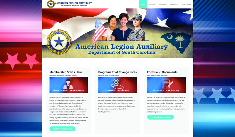
The American Legion Auxiliary is a patriotic veterans support organization. Website colors that reflect this branding would be red, white, and blue — a visual way to give the viewer a quick idea of our organization before reading any text. If your webpage has hot pink, lime green, or teal colors, for example, it doesn’t give the sense that you’re part of a service organization dedicated to veterans, military, and their families. Some simple color changes will go a long way in helping website viewers better identify what our organization is about.
ALA emblem on homepage
It’s very important for the American Legion Auxiliary emblem appear up front and on the homepage of your website to immediately identify that it’s a website of an Auxiliary unit or department. Prominent placement of the emblem will help people associate who we are with what we do. Also, make sure the emblem is large so a person doesn’t have to search for it. Display the emblem proudly!
Take it a step further and use the emblem on each page throughout your website, so if someone first comes to your site through a page other than the homepage, they still see the emblem and know you are with the American Legion Auxiliary.
CONTENT
Who we are
Once someone looks at your website, they will start delving into your content. It’s important to have who we are, what we do, and why we matter front and center. People don’t like to click on multiple tabs to search and may give up if it’s too cumbersome.
Need content ideas for your homepage so it’s immediately clear who the Auxiliary is and what we do?
Also be sure to include tabs at the top of your homepage for important pages such as “About Us,” “Programs,” and “Membership/How to Join.”
Links to ALA national documents
It’s great when units and departments have important documents from ALA National Headquarters on their websites. But, a word of caution — don’t download a national document onto your website because if it gets revised, you will allow an old version to circulate. Rather, include a link to the document’s location on the national website. That way, if there are any revisions, your website links to the newest version.
Contact information
If someone is interested in joining, volunteering, or donating to your ALA unit or department, be sure to always have contact information that is up to date and visible on your website. You don’t want to lose out on any opportunities because your contact information was inaccurate or difficult to find!
Does your unit or department want pointers on making your website better align with the ALA brand? Reach out to National Headquarters at pr@ALAforVeterans.org with the subject line “website help.” We will gladly assist you with your branding needs!
This article was originally published in the August 2019 Auxiliary magazine.
In the spirit of Service, Not Self, the mission of the American Legion Auxiliary is to support The American Legion and to honor the sacrifice of those who serve by enhancing the lives of our veterans, military, and their families, both at home and abroad. For God and Country, we advocate for veterans, educate our citizens, mentor youth, and promote patriotism, good citizenship, peace and security.